ossia score logo

Making of the logo for ossia score, an open source project for an interactive intermedia sequencer for audio visual artists. The main goal was to create a modern logo with the notion of time and taking hint in the elements of the software UI. This timeline shows the process of the creation, which was a collective effort as I constantly asked for feedback from the project team. The best improvement was the second last one which was a simplification I did have in mind from the beginning but was not brave enough to actually try it.
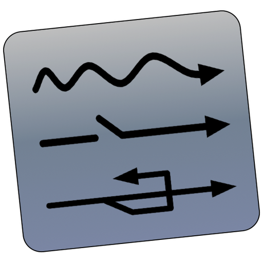
Old logo
This was the previous logo for ossia score (named i-score at the time), using UI elements.
First draft
First draft using the UI color palette and combining three elements of the UI: the trigger (), the state (
) and the condition (
) . I liked that it looked like a stopwatch reminding the time element.

First proposition
Sent this version to the the project team: color variation and improved the bottom line to a make it look more "finished".



Dash element
One of the feedback from the team was to incoporate the dash line to the logo as it is important in the UI.

Adding shadow
Removed the borders and added shadow.

Gradient
Changed the color scheme, added a gradient to add more depth and added the white border to make it look coherent with OSX icons.


Best improvement:
I was pointed out that the top part was not necessarily and without it, it would look much better, reminding the "O" from ossia: it does remove symbolism as the UI element are less recognizable but as a logo it is much better, simple and aesthetically satisfying.

Final result
Finally I removed the white border and the surrounding shadow as it was only to be coherent with OSX icons, which is a not a priority and on other media it looked more elegant without it.
