ossia score UI
Contribution to the graphic design of ossia score, an open source project for an interactive intermedia sequencer for audio visual artists. As I was already involved in this project by creating the current logo and website, I decided to work on the UI too, as it was another one of these interesting graphic aspects for which I could participate as both designer and developper.
So from here, I will explain the main UI evolution steps of ossia score for which I was involved (between 07/2018 to 08/2019). It is more a reminder for myself of the reasons behind the changes I have done, so there might be too much details.
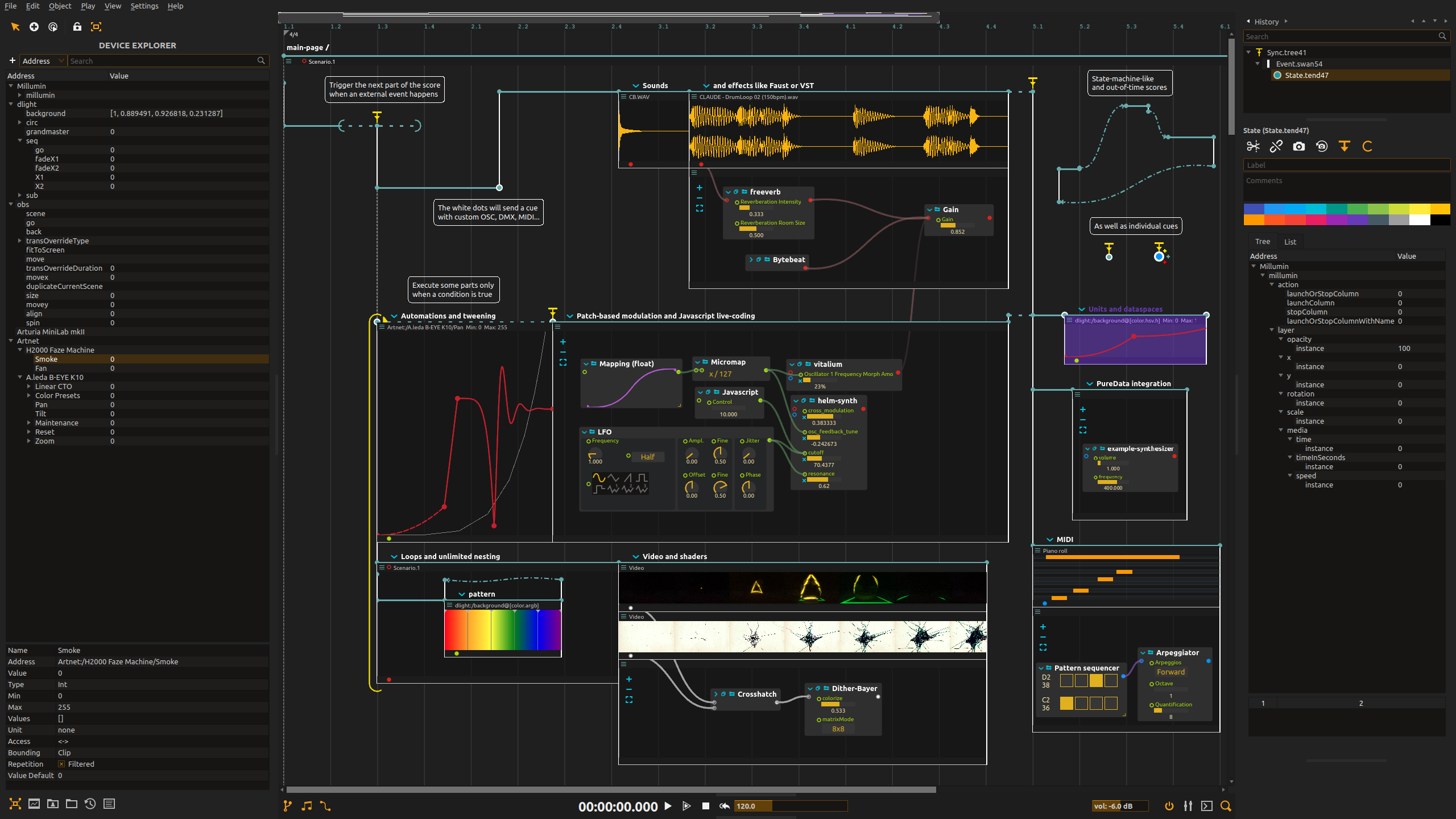
First, the UI looked like this originally. As you can see, it is quite complex with a main workspace in the middle, with panels on the sides and finally icons in the header. One thing that seemed unnecessary to me was the light grey background in the panels and for the icons, as it was adding more color eventhough there were already quite a few in the main zone.
The first remodeling of the UI was the biggest remodeling. I really focused on making the UI look simpler: the grey background was removed and the minimap (top-center) was changed to be more discrete. The color palette was changed as well (highlighted text color, border colors, etc.). It was quite some work but interesting and I was satisfied with how it turned out.
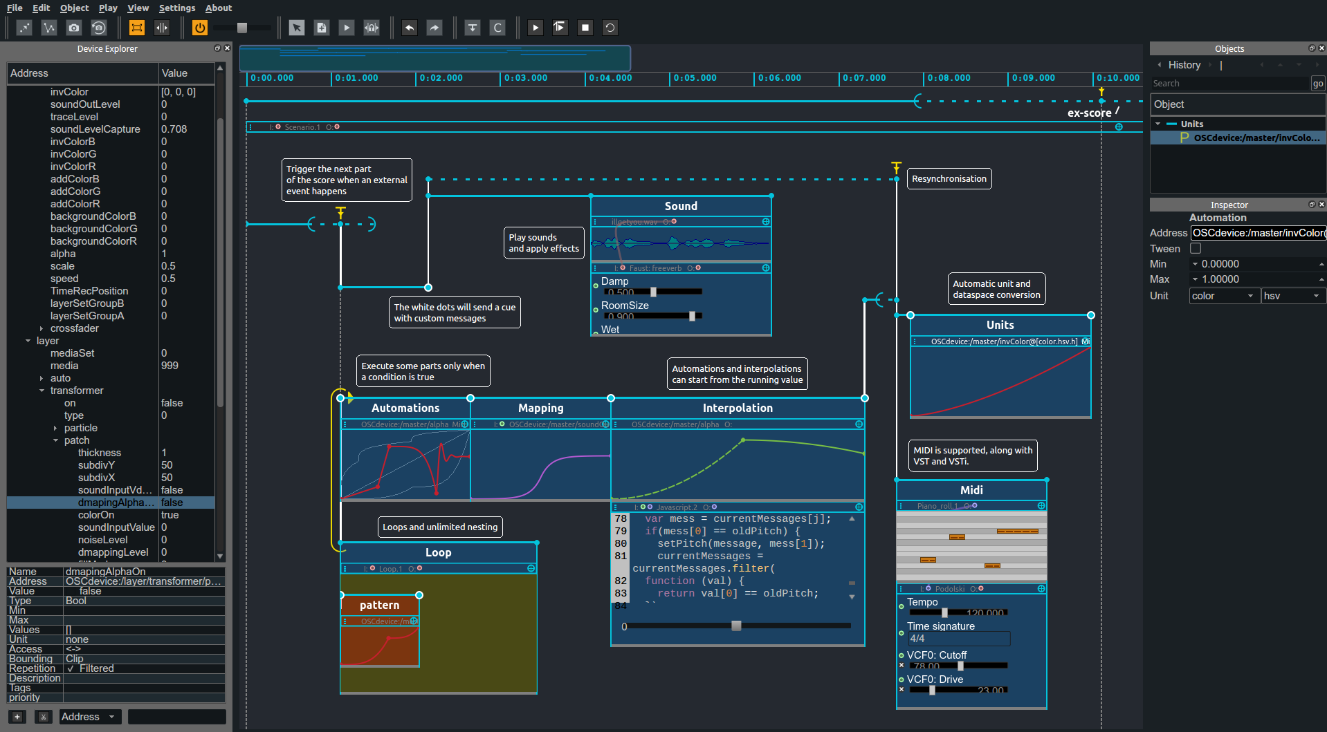
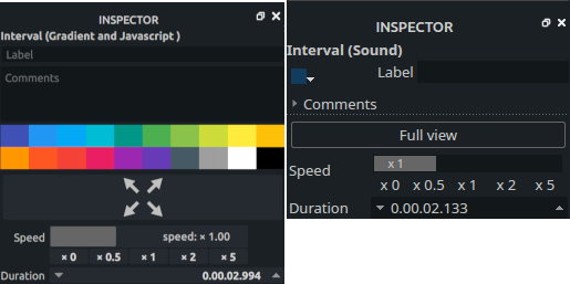
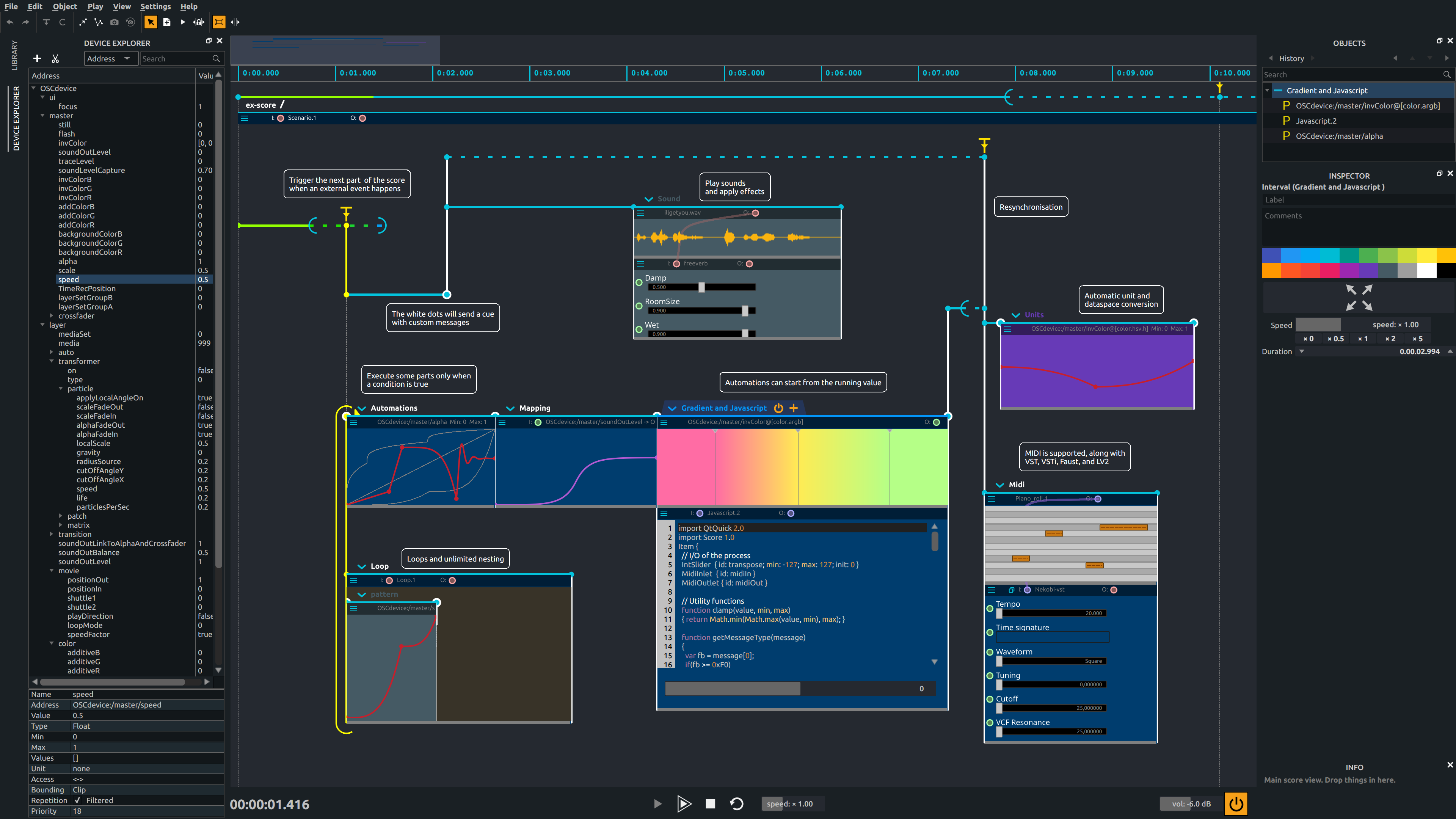
As the UI was starting to look good, I started working on more detailed aspect of the interface: the inspector panel with the selected object information. For this, I exchanged a lot with the main developper to see what could be done to make the UI more simple and easy to use. As a result, the different controls were flatten, the comment box as well as the color palette are always shown, and the fullview button was replaced by an icon since there was already lots of text information.
For the speed control, I definitely wanted to make it more clear that the range of buttons (x0, x0.5, x1, x2, x5) was part of the speed slider. I used a dark grey background with a thin margin between the slider and the buttons to show the unicity, and it seemed to me that it was much more comprehensible than the previous UI. The text alignment was also modified to link more the label to the control.
I did the whole development on this part, as it was simple and small adjustments had to be made (as iterating between the designer and developper takes usually too much time).
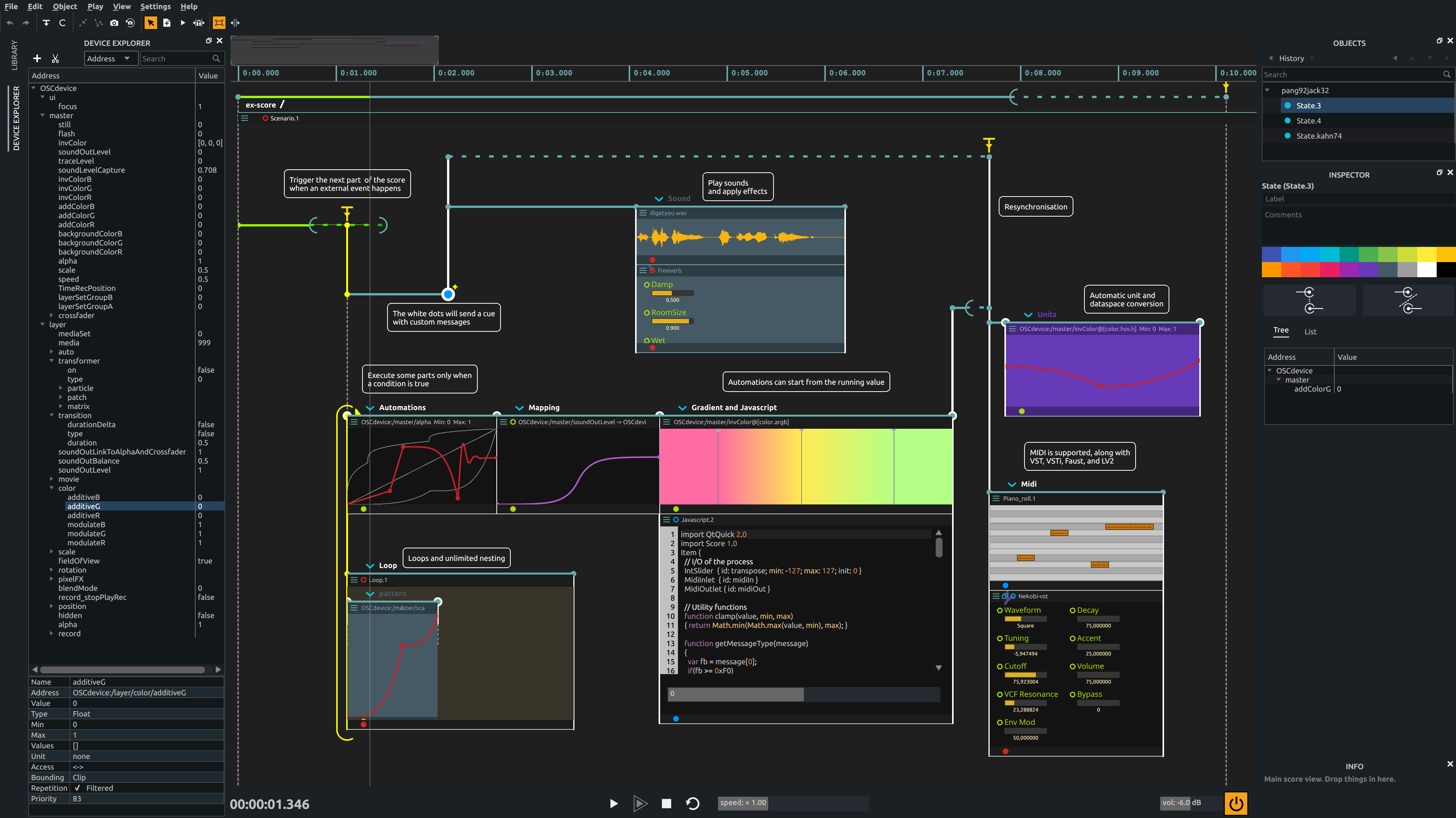
Up until then, I have generally chosen the part I wanted to work on and did not have a clear instruction, but for this step the main goal was to reduce the vertical space the elements in the central workspace were taking. Indeed, users tend to have a lot of “boxes” in the central area which could not be all displayed at once. After several discussion, it was decided that the header could be reduced: the background was once more removed, icons were displayed only when the item was selected making the UI more simple.
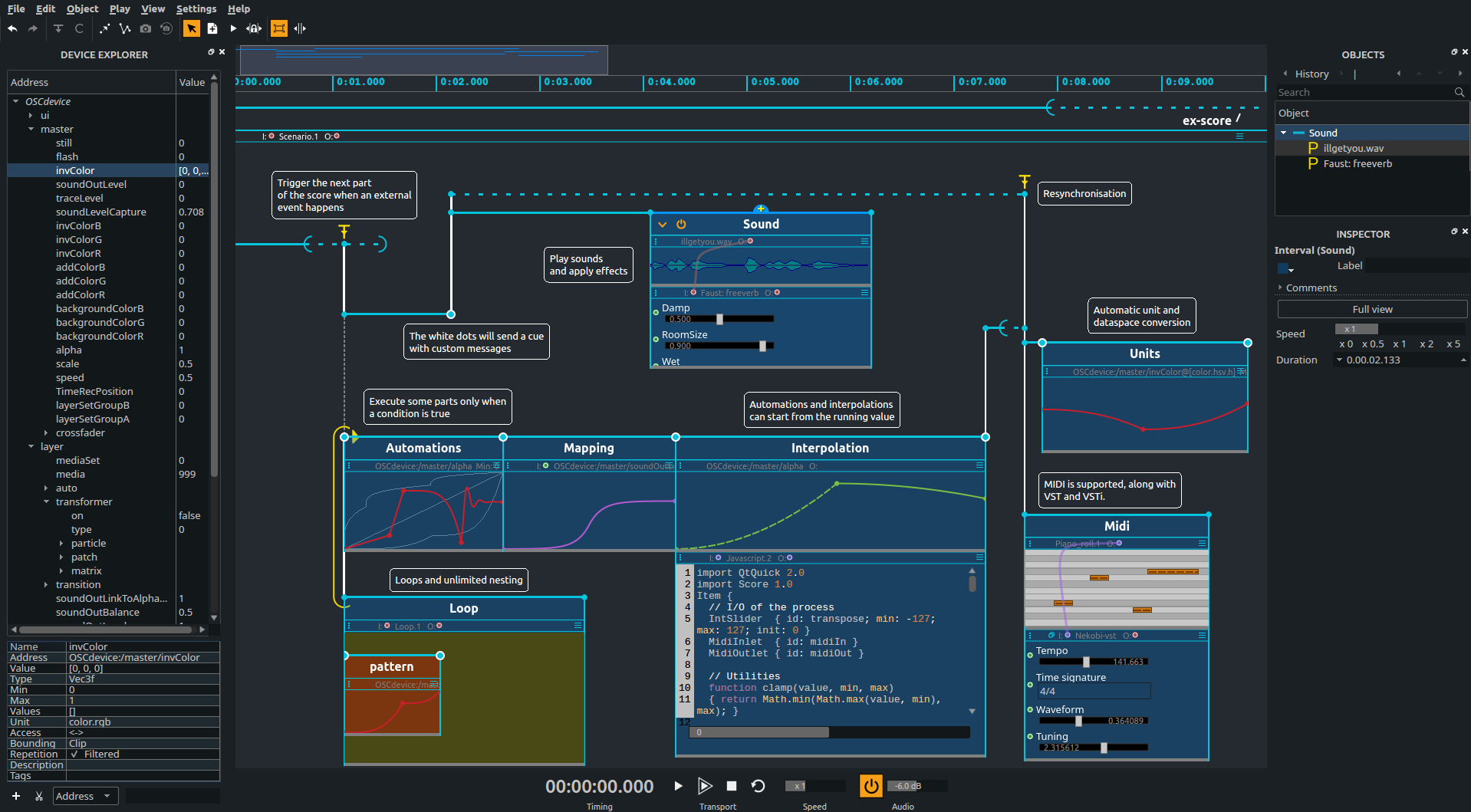
The latest UI redesign concerned mainly redesigning the controls in the boxes and applying a darker color theme to the UI background.